From paper to pixel
For the love of print
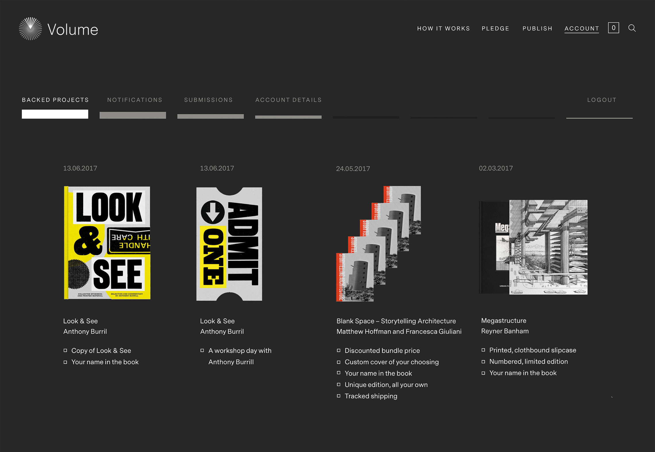
Fucking brilliant
Anthony Burrill
Naming and strategy in collaboration with Darren Wall. Brand animation by Frederico Leggio. Studio shots by Mathias Fossum.
Visit vol.co
Afterthoughts
Get closer
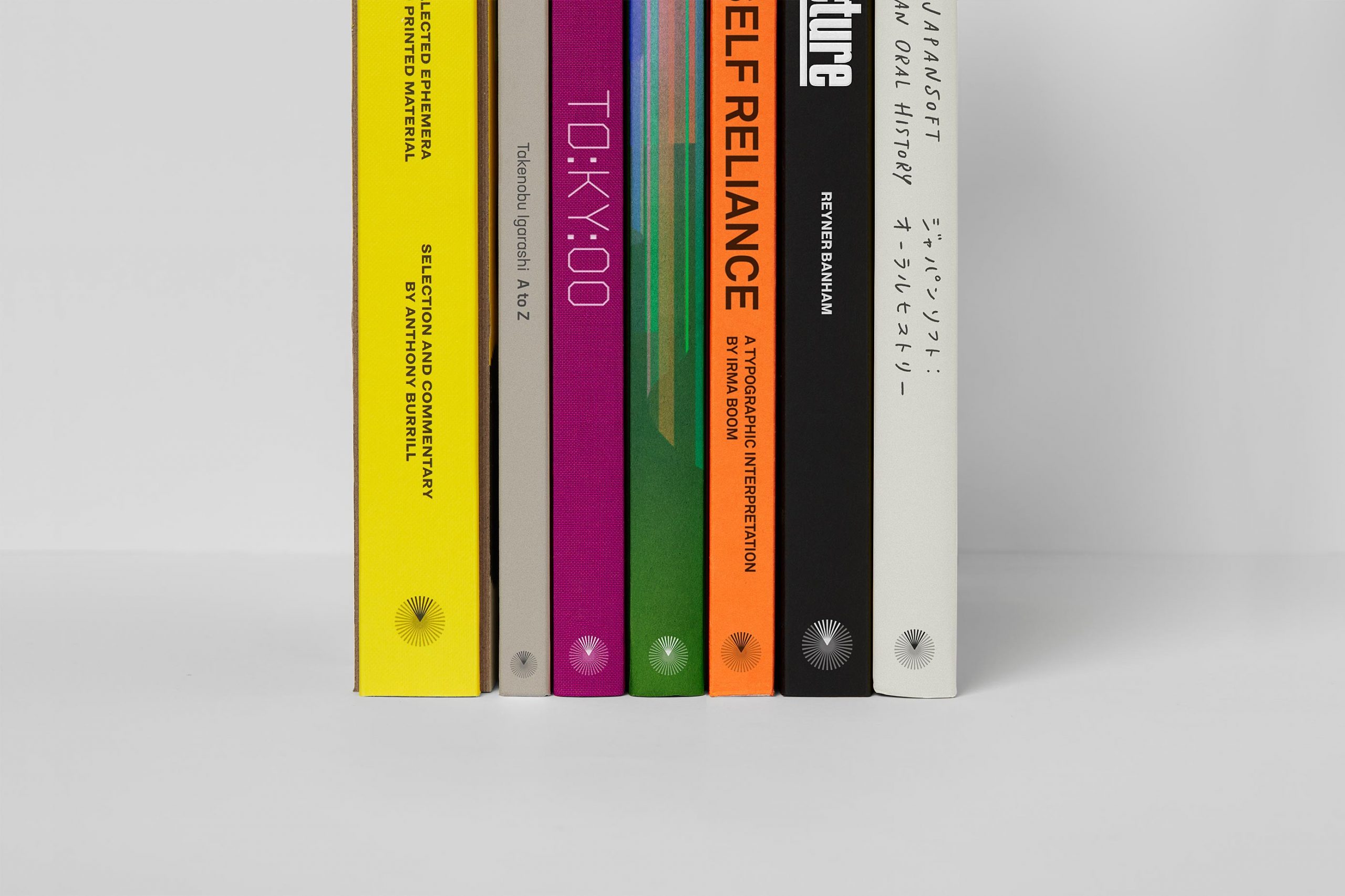
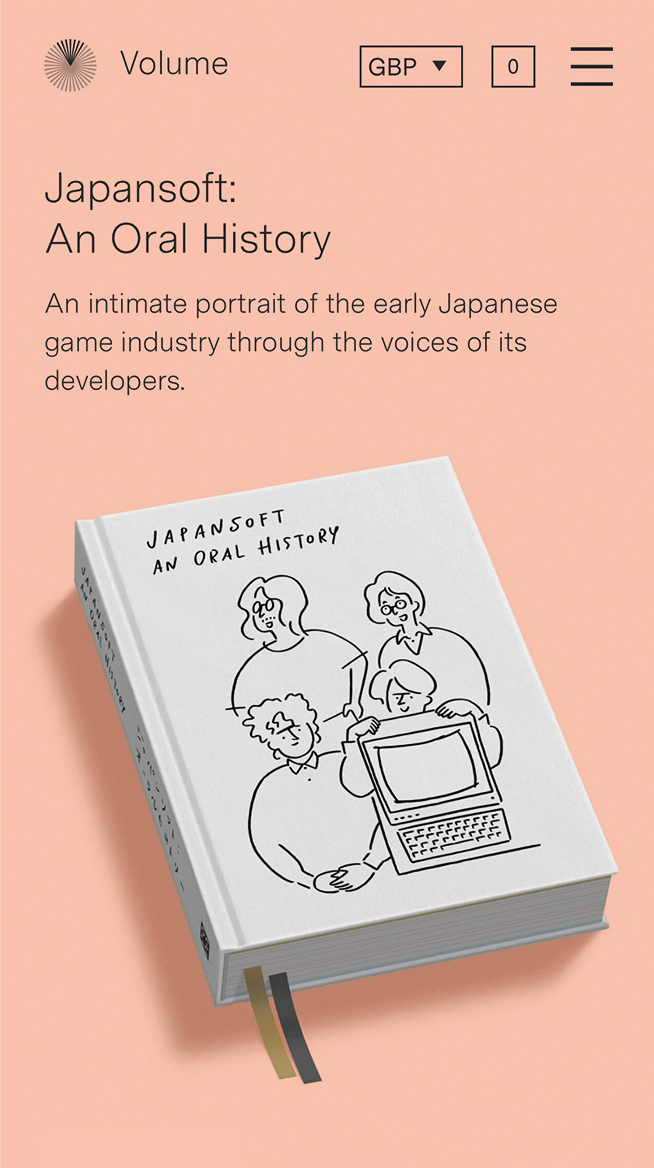
When Thames & Hudson initiated Volume, it was out of curiosity. How do we approach what could be the future of publishing? Would people that love the tactile world of books be convinced? This was also a opportunity for those good ideas that end up in the drawer. Crowdfunding is nothing new, but to concentrate it around illustrated books was a new path for Thames & Hudson. The outcome was nothing but positive. It brought them closer to their audience and it created a community where they got valuable feedback.
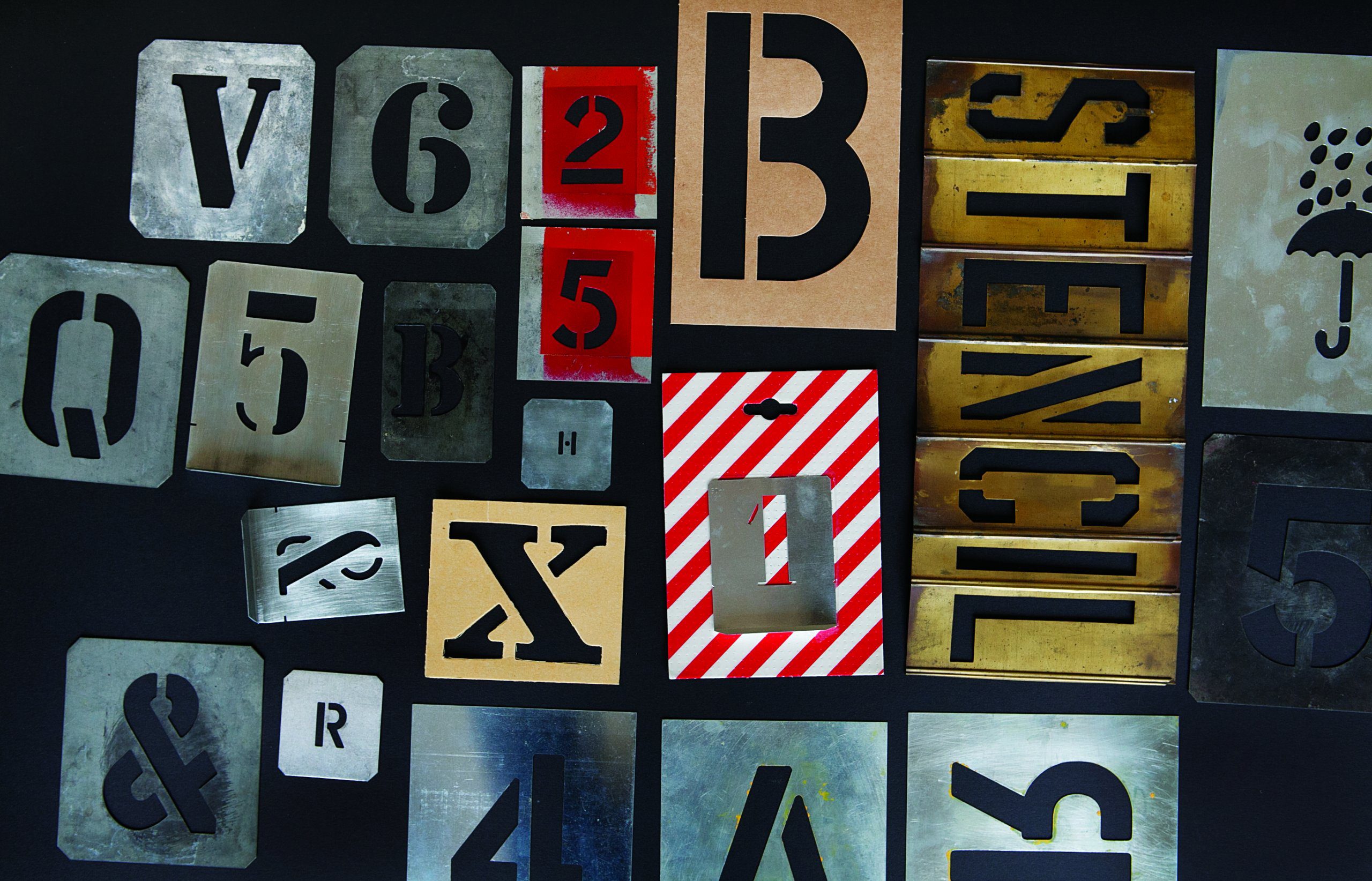
Image courtesy of Anthony Burrill/Volume
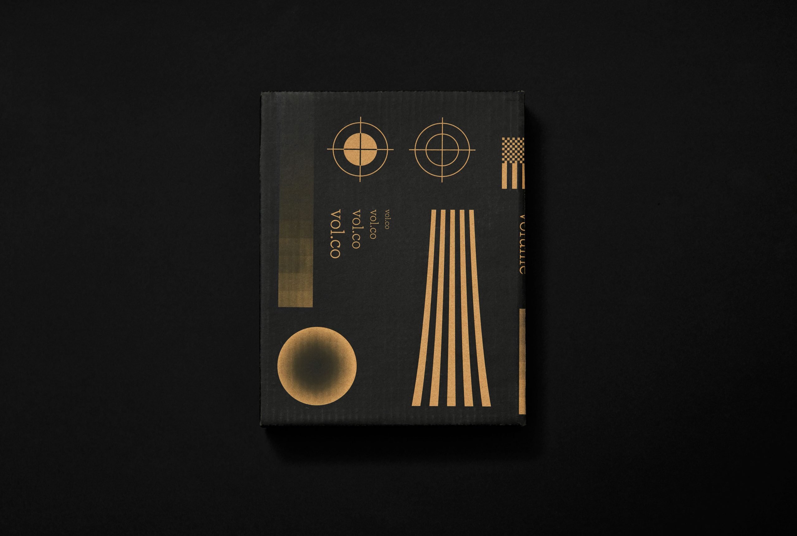
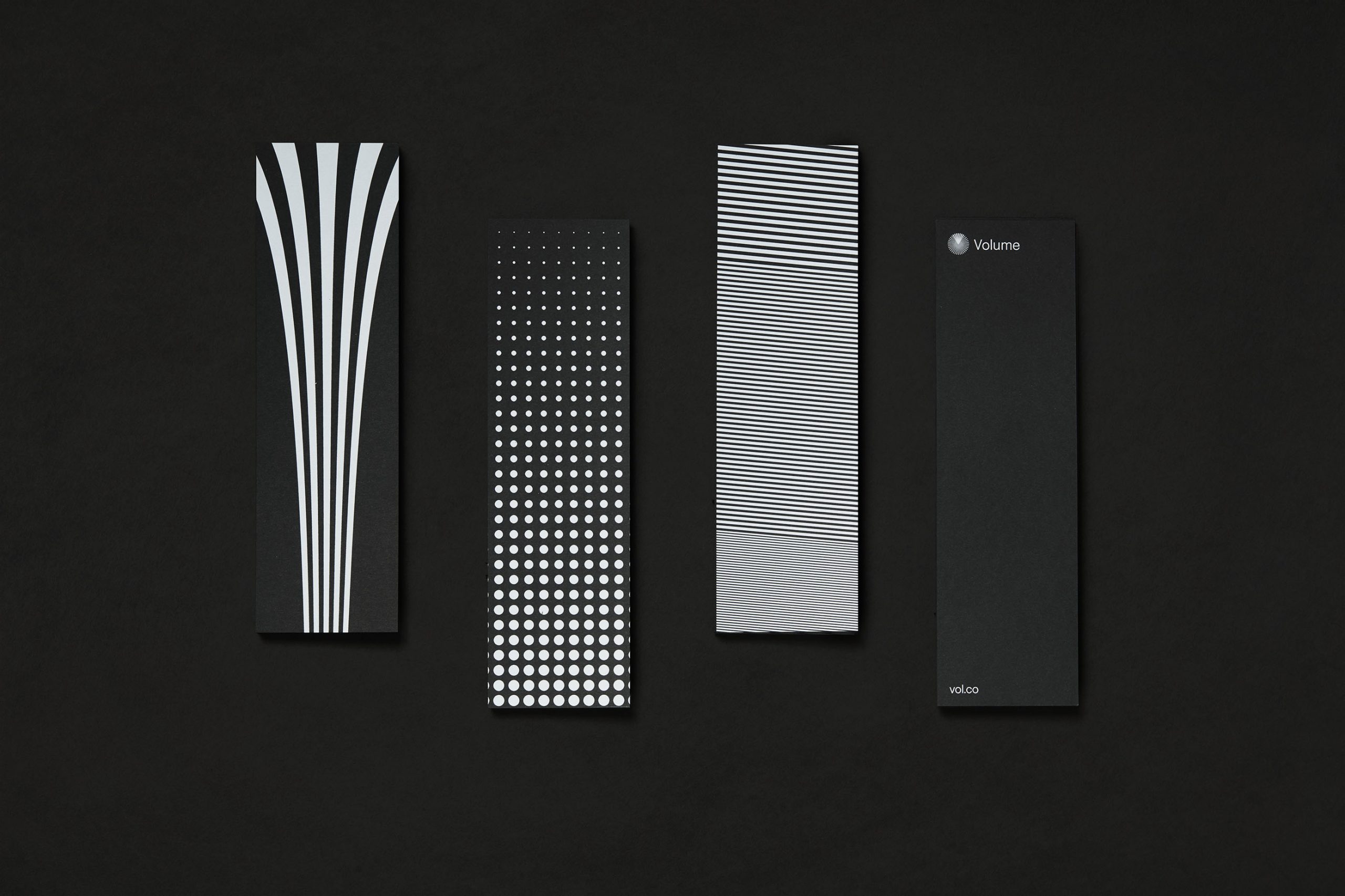
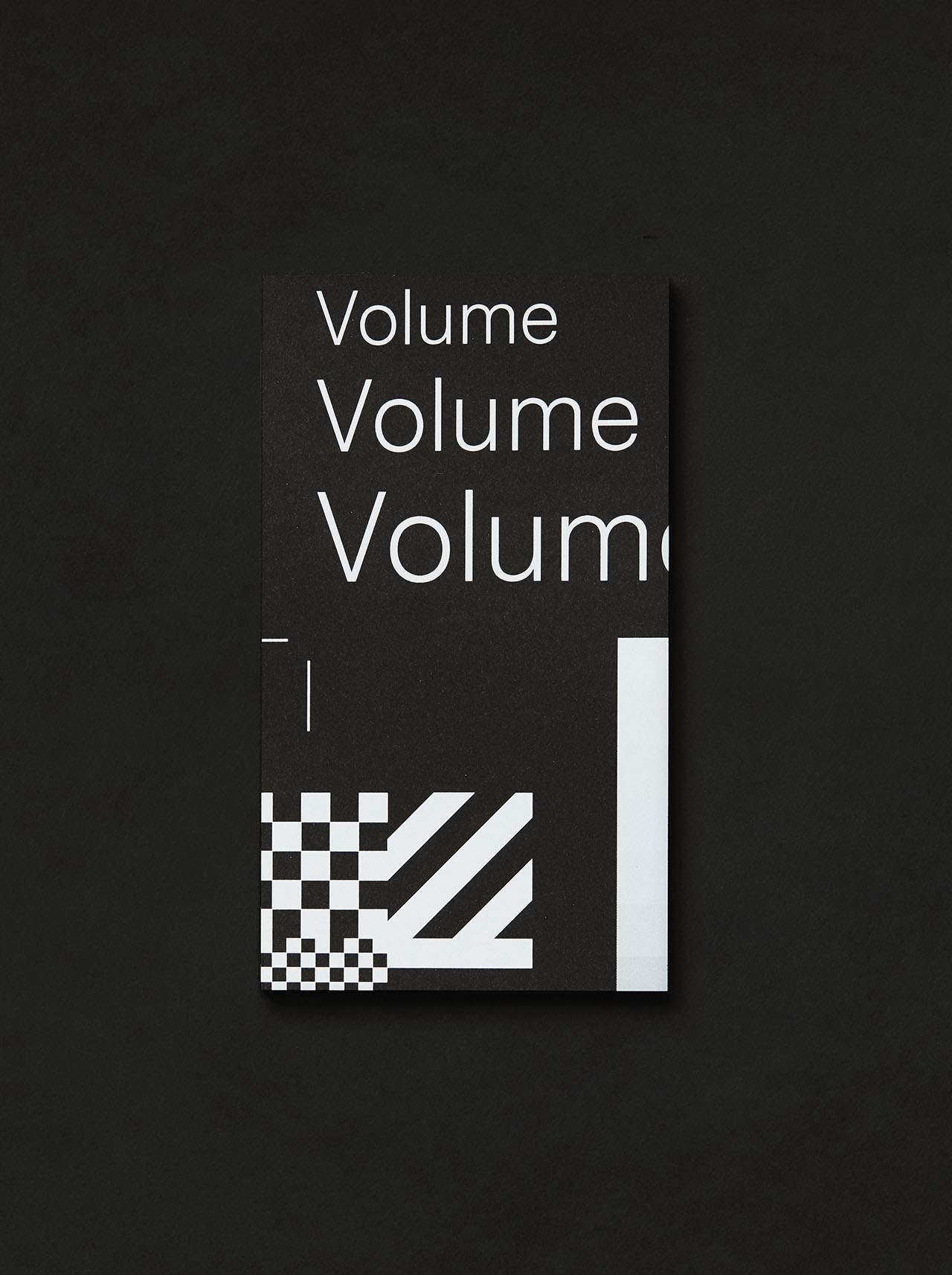
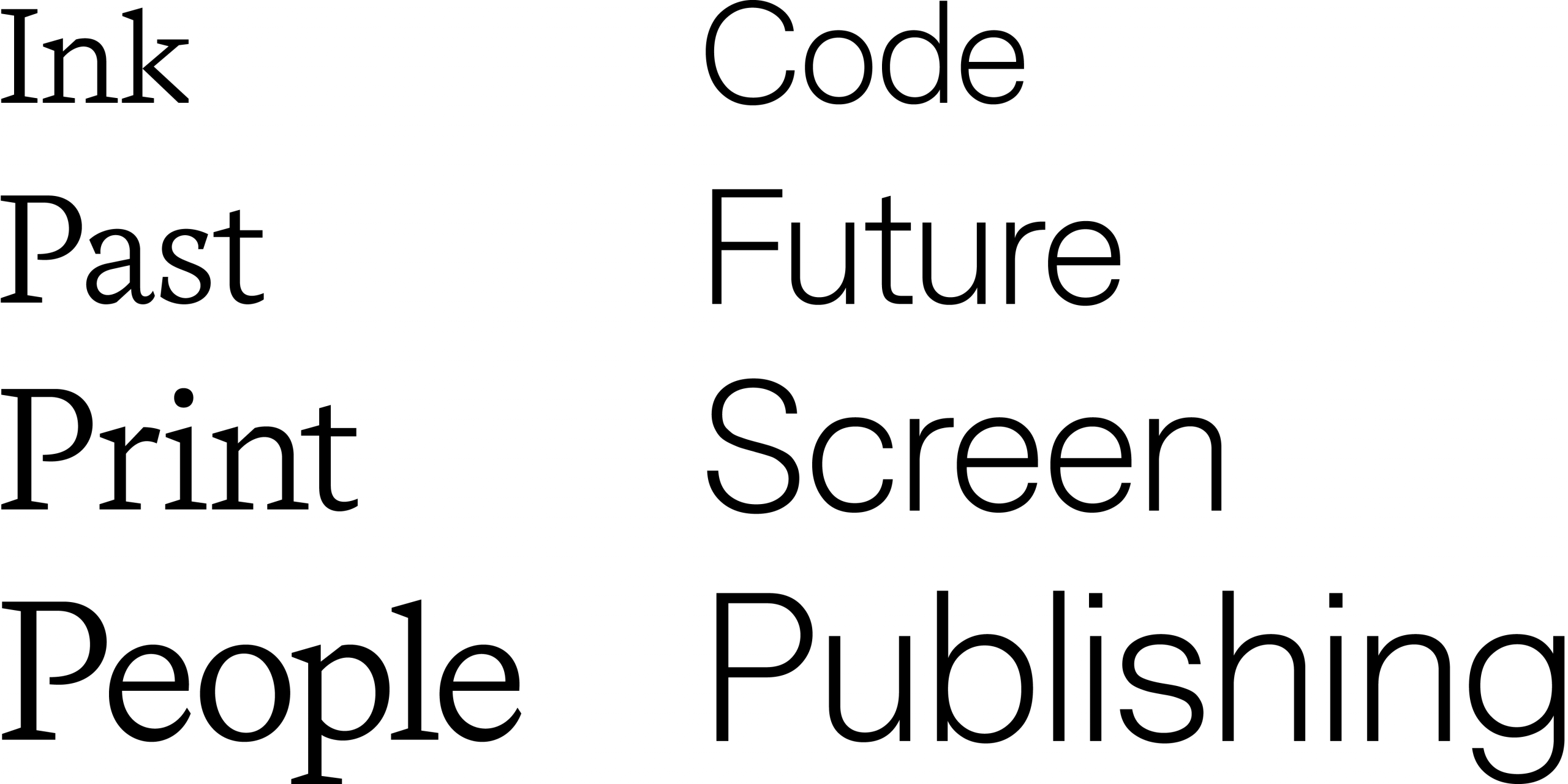
Our challenge was to communicate the aesthetics of print in a digital space. The open and playful approach that Thames & Hudson presented to us, inspired us explore the tools of print and we allowed ourself to be a bit geeky. The identity is tailor-made for the target group, to build that sense of acknowledgement and shared interests. As a fairly small design studio we where quite impressed that we managed to build a crowdfunding platform from scratch. It was a great (but mind-boggling) experience.
