Grocery innovation
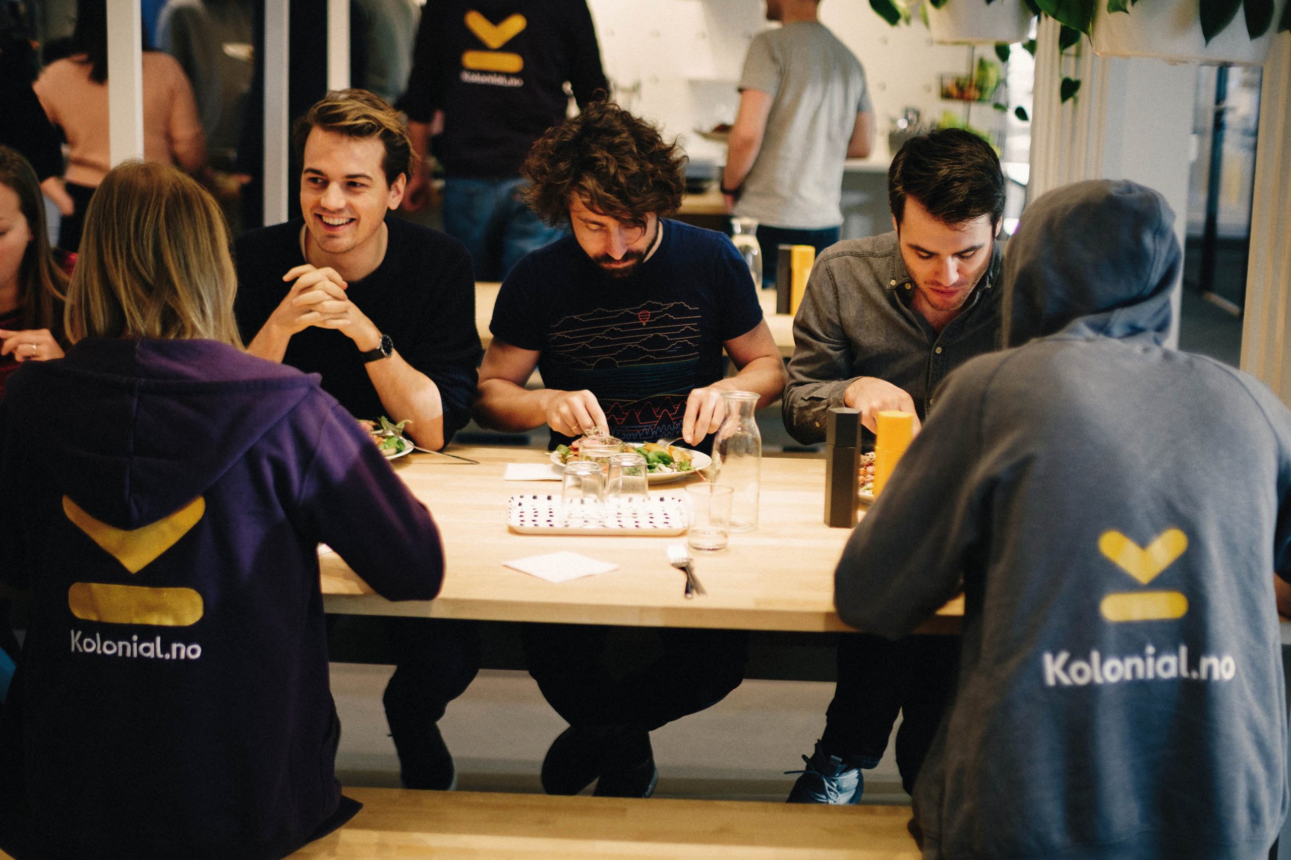
Kolonial.no is Norway’s largest online grocery store. It was launched by a team of ten entrepreneurs with an immense desire to make grocery shopping simpler and less time consuming. Four years later, it is now one of the fastest growing companies in the Nordic region, and well on its way to turn the grocery market upside down.
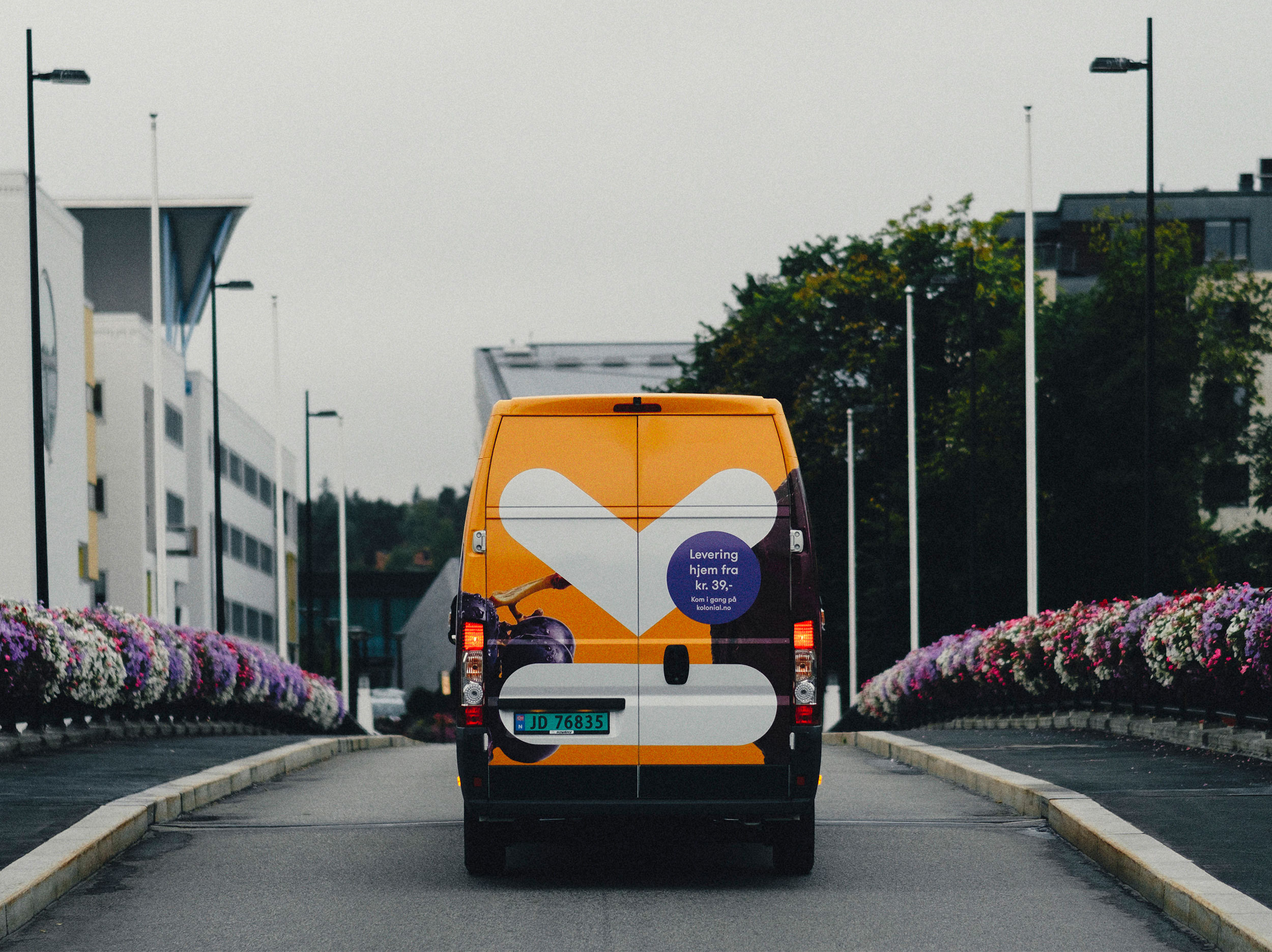
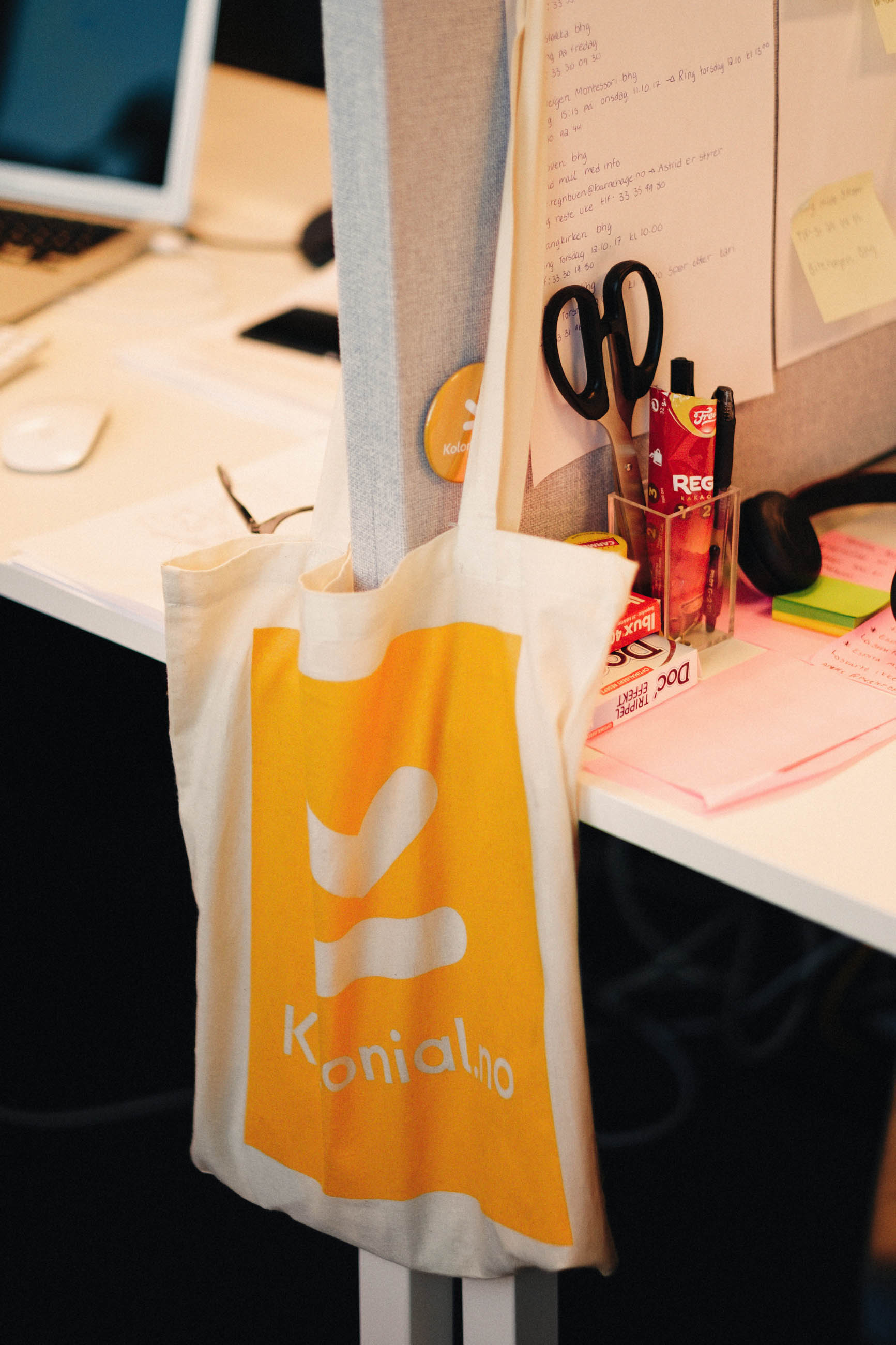
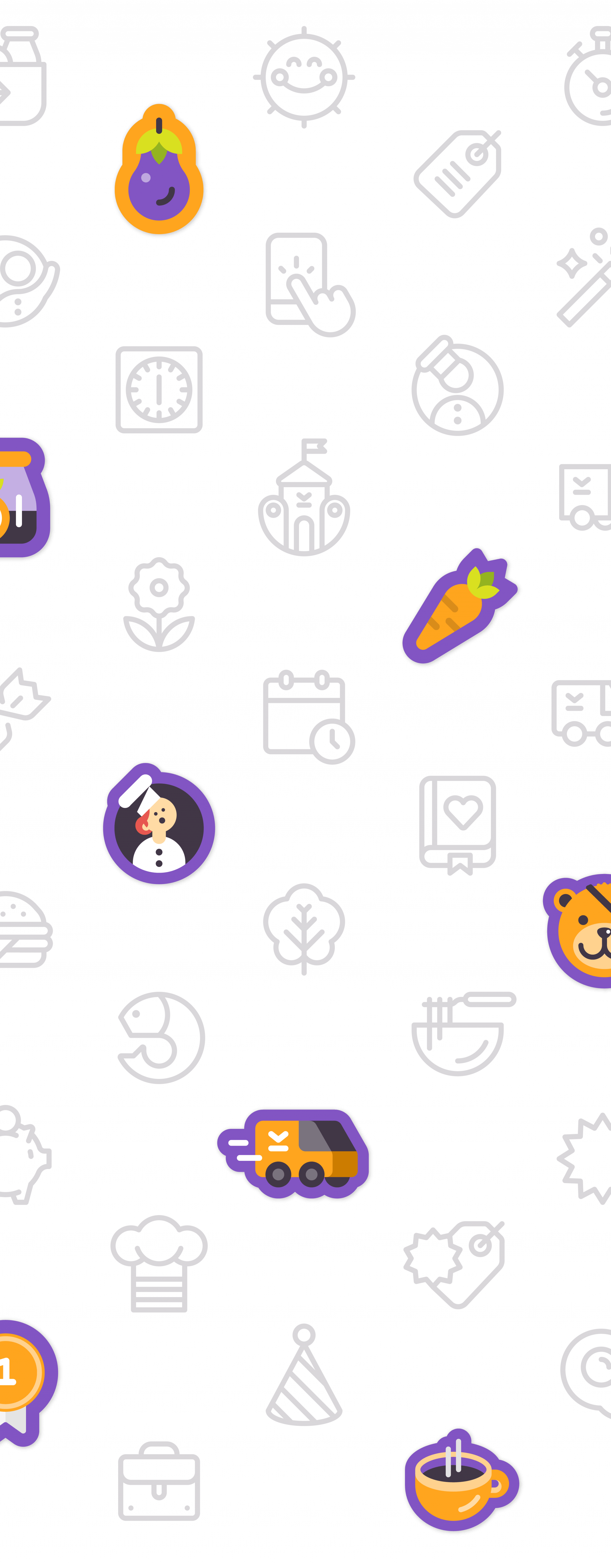
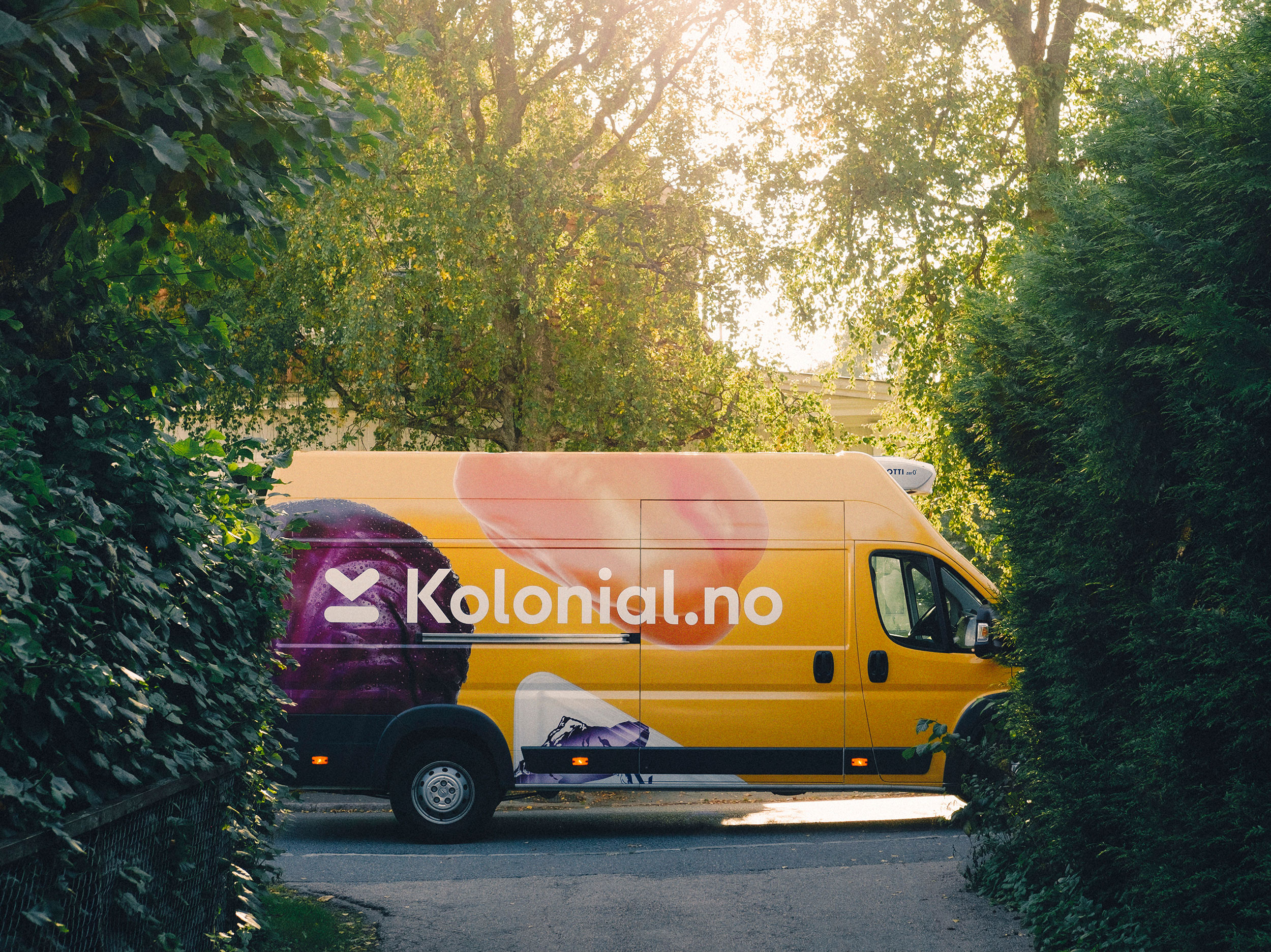
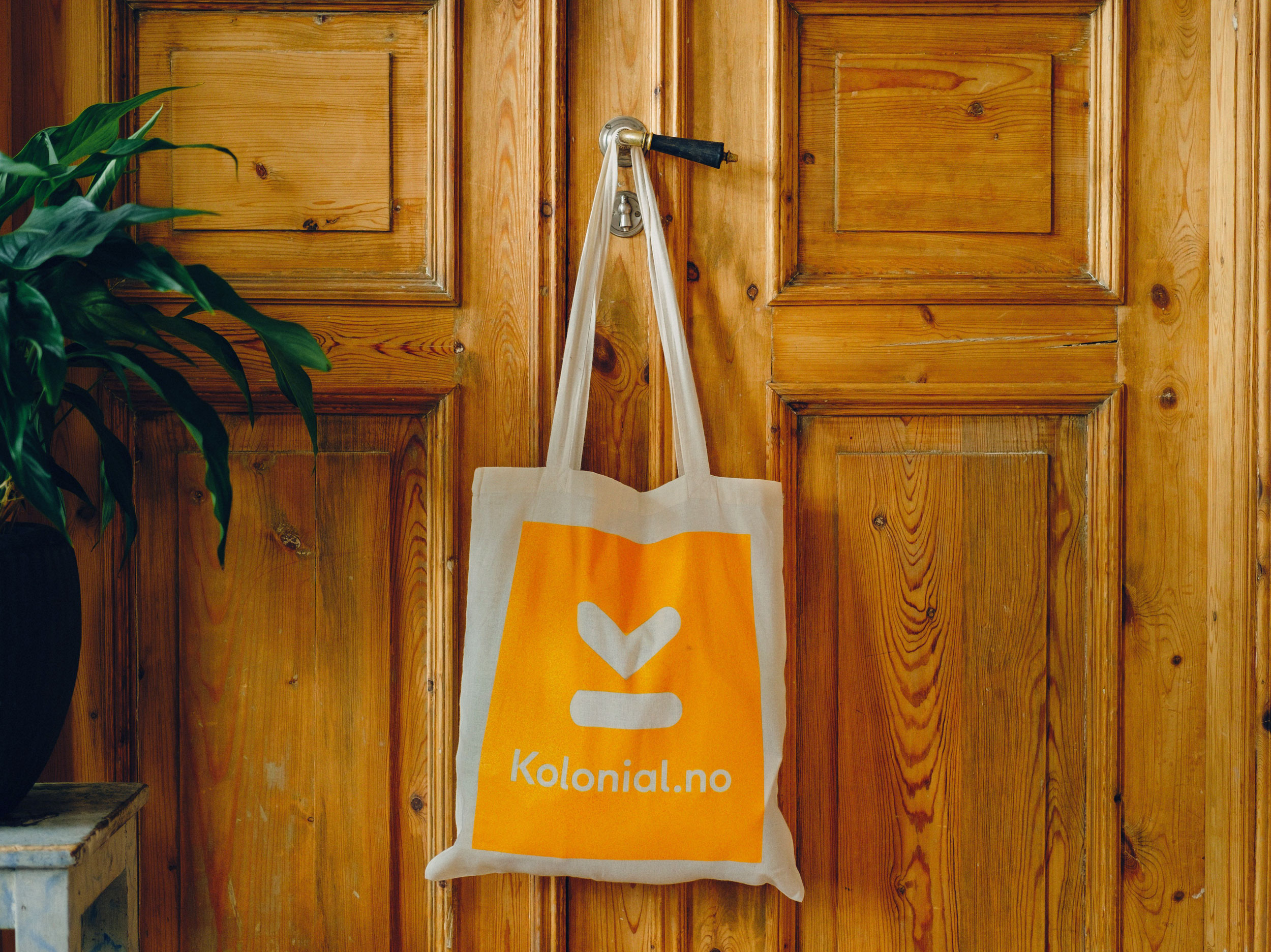
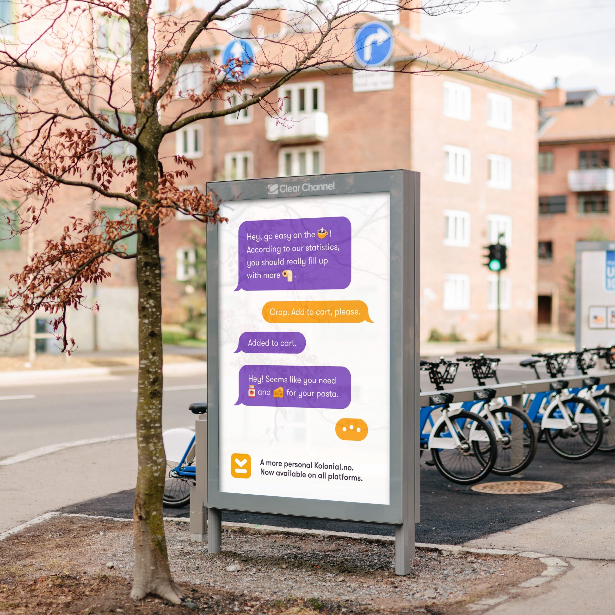
In close collaboration with their team, we’ve developed a rich visual identity that permeates the entire service, from user interface elements to billboards.
A user-oriented design system
Almost needless to say, an identity for a service like this should simplify and enhance the experience of buying groceries. Much is already done in the way Kolonial.no lets you do your shopping from the comfort of your own home, or on the commute. But a multifaceted identity strengthens and enriches both the emotional and functional experience of using this everyday service. Joyful illustrations, rich colors, clear typography, a focused user interface and friendly animations all serve to boost the service.
In fact, customers using Kolonial.no save more money and throw away less food than their former selves. Statistically, they even buy more fruit and vegetables, and less snacks, cigarettes and chocolate than the average customer.

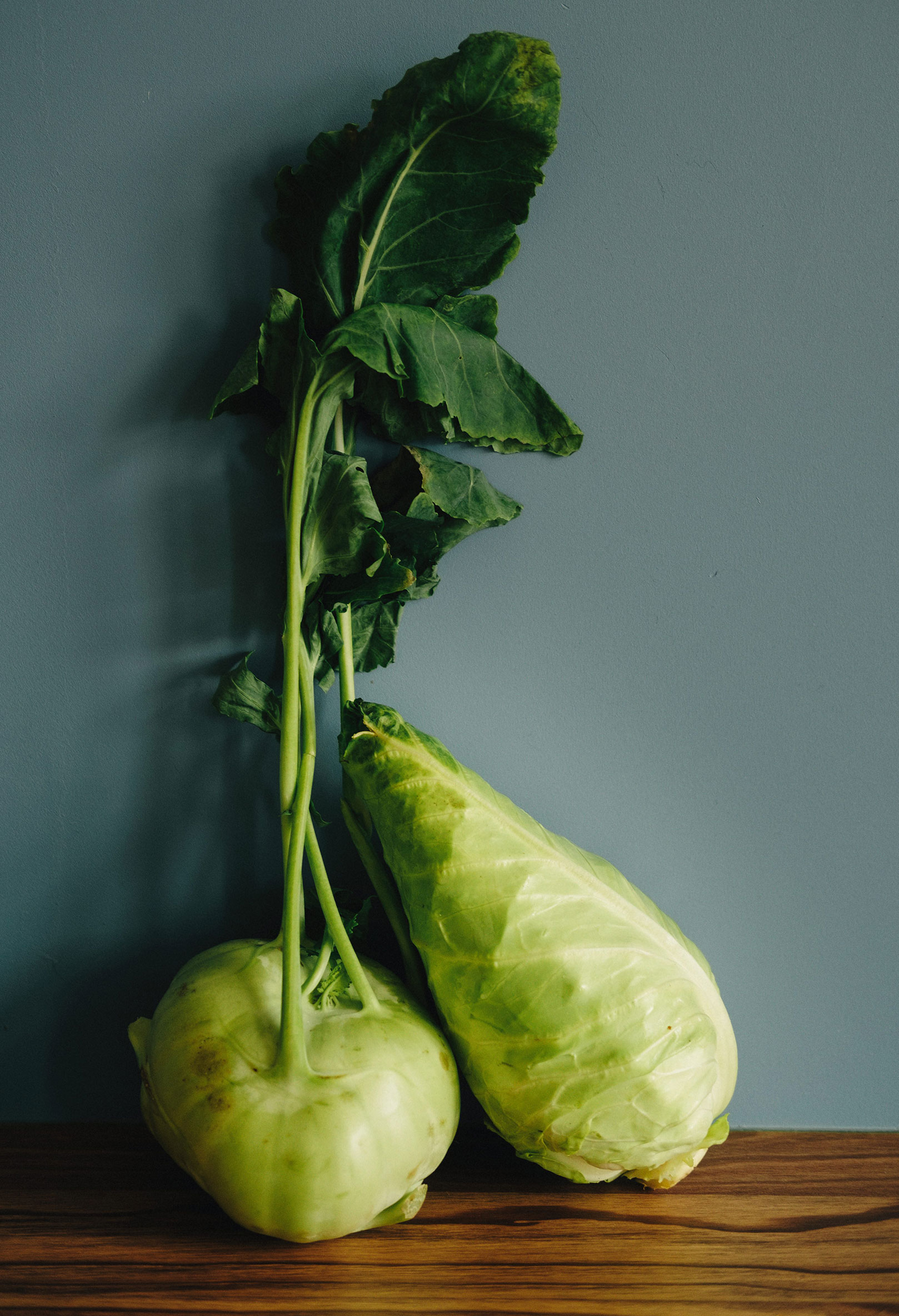
App by Bakken & Bæck. All photography by Åsmund Holien Mo. Art Direction by Kolonial.no.
Reflections
Developing identities for fast-moving companies
Identities for companies in such rapid growth require a design system that is flexible. It has to be capable of shaping and be shaped by all of the service’s different needs.
Kolonial.no has been positioned as an underdog in the grocery market, with a clear entrepreneurial spirit and a voice that is down-to-earth. Its universe is charming and helpful, clutter-free and efficient. But never exclusive or distancing.
